Tailwind style CSS transitions with StimulusJS
If you’ve built UI elements with StimulusJS before, you’ve certainly written code to show or hide an element on the page. Whether you are popping up a modal or sliding out a panel, we’ve all written controller code like:
this.modalTarget.classList.remove("hidden");
To take your UI designs to the next level, you can use transitions so elements don’t immediately appear or disappear from the screen. You can transition opacity to gently fade elements in and use translate to slide them into place.
One issue trying to do these kind of animations with CSS transition properties, as Sebastian De Deyne lays out in this excellent primer on enter and leave transitions, is that you can’t change an element’s display property before the transition occurs. We can use basic transition styles for things like subtly changing a button color on hover, but for smooth animations when elements are shown or hidden, we need something more.
One pattern that has emerged from the Vue and Alpine communities is to use a series of data attributes to define your desired CSS classes during the lifecycle of the transition. TailwindUI also follows this pattern when specifying how to animate their components. It has proven to be powerful and easy to understand.
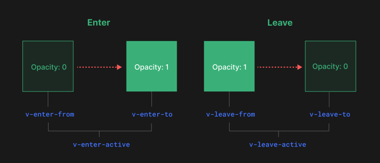
Each project has their own specific naming conventions, but they all define six basic lifecycle “stages”:
- Entering: the classes that should be on an element during the whole time it is entering the page (sometimes called “Entering Active”, “Enter Active”, “Enter”, etc)
- Enter From: the starting point that you will transition from when entering the page (sometimes called “Enter Start”)
- Enter To: the ending point of the transition when entering the page (sometimes called “Enter End”)
- Leaving: the classes that should be on an element during the whole time it is leaving the page (sometimes called “Leaving Active”, “Leave Active”, “Leave”, etc)
- Leave From: the starting point that you will transition from when leaving the page (sometimes called “Leave Start”)
- Leave To: the ending point of the transition when leaving the page (sometimes called “Leave End”)
This picture from the Vue docs really helped me visualize how it all works:
The approach of using data attributes works well with Tailwind’s transition utility classes and feels right at home with the StimulusJS philosophy of augmenting HTML markup.
Vue (Transition) and Alpine (x-transition) provide native, first-party support for these transitions, but for a Rails app using Hotwire, we’ll have to add this functionality ourselves.
Options
I explored a few different options in this space. Here are the most popular approaches I came across:
stimulus-transitions
This library provides a transition controller that you can import and register. You use this controller like a normal Stimulus controller in your application:
<div
  data-controller="transition"
  data-transition-enter-active="enter-class"
  data-transition-enter-from="enter-from-class"
  data-transition-enter-to="enter-to-class"
  data-transition-leave-active="or-use multiple classes"
  data-transition-leave-from="or-use multiple classes"
  data-transition-leave-to="or-use multiple classes"
>
  <!-- content -->
</div>
The controller will automatically detect when the element is shown or hidden and run the transitions. There are also options for listening to custom transition:end-enter and transition:end-leave events if you want to run additional code when the transitions have finished.
The transition controller needs something to trigger the display style on the element so you will need an application-level controller to kick off the process.
stimulus-use/useTransition
The stimulus-use project is a collection of reusable behaviors for Stimulus. If you are familiar with React, this project is similar to React’s hooks system, but for Stimulus controllers.
One particular mix-in available in this package is useTransition. You can call this from your own Stimulus controller and it will run the transitions on the element (either reading from data- attributes or you can specify the classes in JavaScript as options).
This particular mix-in was flagged as a “beta” release at the time of this writing.
el-transition
This library is not Stimulus specific, but implements the same Vue/Alpine transition pattern. Since it is vanilla Javascript, there are no built-in hooks for Stimulus lifecycle or controllers to register. You import enter and leave functions directly and then call them while providing the element to transition.
import { enter, leave } from "el-transition";

// in your stimulus controller somewhere
enter(this.modalTarget);
leave(this.modalTarget);
The whole library is really just one, 60 line file so you can even just drop it into your project directly if you want to vendor it.
My recommendation: el-transition
All three libraries could do what I wanted: apply Vue/Alpine style data- attribute transitions.
I had the most success with el-transition and selected it for my project.
I liked that it was super simple and not tied to the framework. It has a minimal surface-area and I didn’t have to rely on an external library to update for newer Stimulus releases if there are breaking changes.
One extra bonus was that enter and leave functions returned Promise objects, which worked much better for coordinating multiple elements that need to transition (this is pretty common in the TailwindUI components).
Building the Tailwind UI Slide Over Menu
Let’s put this advice into practice by building a slide-over menu from TailwindUI.
Start by grabbing the HTML code template (we’re using one of the free samples for this article).
In this case, we’ll create a slide-over controller, with targets for the three parts in the Tailwind markup (backdrop, panel, and closeButton) and then one more for the whole menu (container).
Notice there are several code comments that highlight various parts of the component and how to transition them.
<!--
  Background backdrop, show/hide based on slide-over state.

  Entering: "ease-in-out duration-500"
    From: "opacity-0"
    To: "opacity-100"
  Leaving: "ease-in-out duration-500"
    From: "opacity-100"
    To: "opacity-0"
-->
<div class="fixed inset-0 transition-opacity bg-gray-500 bg-opacity-75"></div>
For each of these component parts, we’re going to bind them as Stimulus targets and also add in the data attributes to match the specification.
<div data-controller="slide-over">
  ...

  <div
    data-slide-over-target="backdrop"
    class="fixed inset-0 transition-opacity bg-gray-500 bg-opacity-75"
    data-transition-enter="ease-in-out duration-500"
    data-transition-enter-start="opacity-0"
    data-transition-enter-end="opacity-100"
    data-transition-leave="ease-in-out duration-500"
    data-transition-leave-start="opacity-100"
    data-transition-leave-end="opacity-0"
  ></div>

  ...
</div>
Repeat this for the other elements that we want to animate. We’ll also add a basic <button> to show the panel when clicked.
Here is the full markup:
<div data-controller="slide-over">
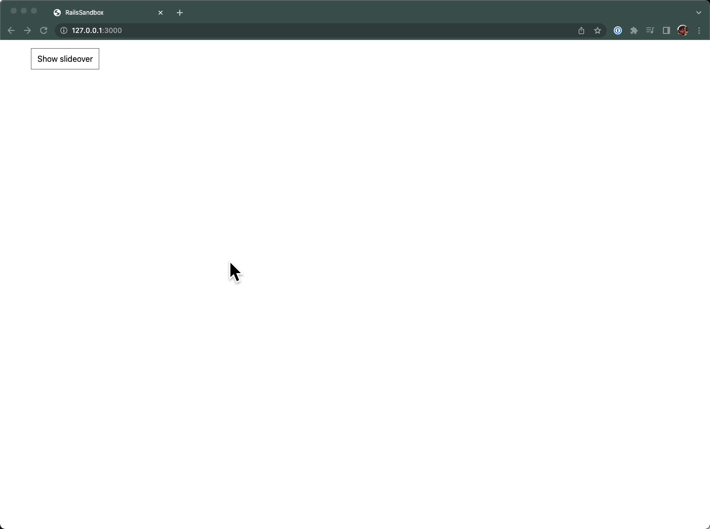
<button class="form-input" data-action="slide-over#show">
Show slideover
</button>
<!-- This example requires Tailwind CSS v2.0+ -->
<div
data-slide-over-target="container"
class="relative z-10 hidden"
aria-labelledby="slide-over-title"
role="dialog"
aria-modal="true"
>
<!--
Background backdrop, show/hide based on slide-over state.
Entering: "ease-in-out duration-500"
From: "opacity-0"
To: "opacity-100"
Leaving: "ease-in-out duration-500"
From: "opacity-100"
To: "opacity-0"
-->
<div
data-slide-over-target="backdrop"
class="fixed inset-0 transition-opacity bg-gray-500 bg-opacity-75"
data-transition-enter="ease-in-out duration-500"
data-transition-enter-start="opacity-0"
data-transition-enter-end="opacity-100"
data-transition-leave="ease-in-out duration-500"
data-transition-leave-start="opacity-100"
data-transition-leave-end="opacity-0"
></div>
<div class="fixed inset-0 overflow-hidden">
<div class="absolute inset-0 overflow-hidden">
<div
class="fixed inset-y-0 right-0 flex max-w-full pl-10 pointer-events-none"
>
<!--
Slide-over panel, show/hide based on slide-over state.
Entering: "transform transition ease-in-out duration-500 sm:duration-700"
From: "translate-x-full"
To: "translate-x-0"
Leaving: "transform transition ease-in-out duration-500 sm:duration-700"
From: "translate-x-0"
To: "translate-x-full"
-->
<div
data-slide-over-target="panel"
class="relative w-screen max-w-md pointer-events-auto"
data-transition-enter="transform transition ease-in-out duration-500 sm:duration-700"
data-transition-enter-start="translate-x-full"
data-transition-enter-end="translate-x-0"
data-transition-leave="transform transition ease-in-out duration-500 sm:duration-700"
data-transition-leave-start="translate-x-0"
data-transition-leave-end="translate-x-full"
>
<!--
Close button, show/hide based on slide-over state.
Entering: "ease-in-out duration-500"
From: "opacity-0"
To: "opacity-100"
Leaving: "ease-in-out duration-500"
From: "opacity-100"
To: "opacity-0"
-->
<div
data-slide-over-target="closeButton"
class="sm:-ml-10 sm:pr-4 absolute top-0 left-0 flex pt-4 pr-2 -ml-8"
data-transition-enter="ease-in-out duration-500"
data-transition-enter-start="opacity-0"
data-transition-enter-end="opacity-100"
data-transition-leave="ease-in-out duration-500"
data-transition-leave-start="opacity-100"
data-transition-leave-end="opacity-0"
>
<button
type="button"
data-action="slide-over#hide"
class="hover:text-white focus:outline-none focus:ring-2 focus:ring-white text-gray-300 rounded-md"
>
<span class="sr-only">Close panel</span>
<!-- Heroicon name: outline/x -->
<svg
class="w-6 h-6"
xmlns="http://www.w3.org/2000/svg"
fill="none"
viewBox="0 0 24 24"
stroke-width="2"
stroke="currentColor"
aria-hidden="true"
>
<path
stroke-linecap="round"
stroke-linejoin="round"
d="M6 18L18 6M6 6l12 12"
/>
</svg>
</button>
</div>
<div
class="flex flex-col h-full py-6 overflow-y-auto bg-white shadow-xl"
>
<div class="sm:px-6 px-4">
<h2
class="text-lg font-medium text-gray-900"
id="slide-over-title"
>
Panel title
</h2>
</div>
<div class="sm:px-6 relative flex-1 px-4 mt-6">
<!-- Replace with your content -->
<div class="sm:px-6 absolute inset-0 px-4">
<div
class="h-full border-2 border-gray-200 border-dashed"
aria-hidden="true"
>
Your content goes here! How about a lazy-loaded turbo-frame?
</div>
</div>
<!-- /End replace -->
</div>
</div>
</div>
</div>
</div>
</div>
</div>
</div>
And now we need to actually implement the Stimulus controller to run the transitions.
import { Controller } from "@hotwired/stimulus";
import { enter, leave } from "el-transition";

export default class extends Controller {
  static targets = ["container", "backdrop", "panel", "closeButton"];

  show() {
    this.containerTarget.classList.remove("hidden");
    enter(this.backdropTarget);
    enter(this.closeButtonTarget);
    enter(this.panelTarget);
  }

  hide() {
    Promise.all([
      leave(this.backdropTarget),
      leave(this.closeButtonTarget),
      leave(this.panelTarget),
    ]).then(() => {
      this.containerTarget.classList.add("hidden");
    });
  }
}
When the show action is called (by clicking the button), we remove the hidden class on the whole container and then run the enter function from el-transition on each of the targets we want to animate. This will fade in the backdrop and close button and slide over the panel using the Tailwind classes we defined in the data attributes.
When we trigger the hide action (by clicking the close button), we do everything in reverse. We run the leave function and the panel slides back over and the backdrop and close button fade away. Once all the transitions are done, we hide the whole container. By using Promise.all we can wait all of the individual transitions to finish (remember they may have different durations!) before hiding the container.
No need for setTimeout or flashing of content when the transition is finished and then removed!
It’s not quite as convenient as dropping in the React or Vue snippets from TailwindUI, but it’s pretty close!
You may want to take this a step further by extracting the markup into a partial or use ViewComponent to clean up the code, but that is left as an exercise for the reader.
Wrap it up
It’s great to follow other front-end communities and bring back ideas into your own ecosystem. Vue and Alpine have established a really clear, understandable pattern for specifying CSS transitions and we can leverage that work in a StimulusJS/Hotwire project with a small library.
These transitions take a bit of time to wrap your head around, but they add a nice level of polish to your UI components with minimal effort: exactly the kind of high leverage techniques we want when building apps in the “boring Rails” style.
Was this article valuable? Subscribe to the low-volume, high-signal newsletter. No spam. All killer, no filler.